Mobile Game Ads: What’s Going On?!
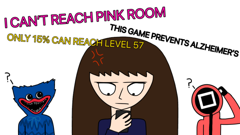
Picture this: it’s the weekend. You’re sitting on your couch and playing a game on your phone. It’s one of your favorite games to pass time with, and you decide to watch an ad for an in-game reward. As your finger presses the button, you brace yourself for the inevitable fate that awaits you. And when the ad finally loads, you see it. The big bold letters at the top of the screen: “I CANT REACH PINK ROOM!! Can you do better??” Your eyes roll in annoyance as you come to the realization that you have to sit through another crummy twenty-second-long video of someone failing miserably at a task that can be accomplished by a toddler. Does this scenario sound familiar? It’s happened to all of us before. The dreaded phenomenon known simply as the mobile game ad. If you play games on your phone or tablet, you’ve seen several ads like the ones described above. You either hate them or love to hate them, and it’s not hard to see why. Everything from the annoying message at the top of the screen to the poor animation quality to the background music is pure, utter cringe. By viewing several of these crummy ads, I have gotten an idea of why they’re so obnoxious. Like most advertisements, mobile game ads are meant to make you want to download the app they are promoting. The only problem is the way they promote these otherwise fun apps. Here are a few examples of what makes them so annoying and why: • The text at the top of the screen. Usually these messages say “I can’t reach [insert color] [insert noun]” or “Only 15% can reach level 57”. These messages are meant to encourage you to reach that level by downloading the game. But, in reality, you can reach that “impossible level” within a matter of days (or even hours). Some other messages include things along the lines of “most relaxing game ever” or “doctors say playing this game for 10 minutes every day will raise your IQ”. • The “mom vs. dad” format. This format is fairly uncommon, but it’s mostly used with tycoon games. The format shows the screen split into two sections, one side labeled “mom” and the other “dad”. The “dad” side is shown with the lowest level and struggling to level up even once, while the “mom” side is shown with the highest level and effortlessly leveling up. Nobody knows what this format is trying to tell us, but, in my opinion, it’s not doing its job very well. • Pop culture. This is by far the most hated strategy out there. In this kind of ad, popular characters and celebrities are shown as playable characters in the game. Most ads depict concepts similar to that of Squid Game and Poppy Playtime, two very popular targets for ads. But how did a Netflix k-drama and a horror game get pulled into the mobile game market? No one knows… • Live action. Some ads use footage of actual people playing their game. However, it’s not had to tell that it’s just footage of a guy or a girl aimlessly clicking a phone screen and pretending to play a game. All of these tactics are annoying in their own ways, but there’s one tactic that gets people’s blood boiling every time. Drumroll, please…false advertising. And when I say false advertising, I’m talking about the two main series that have everyone confused. The global icons of mobile ads…Lily’s Garden and the -scapes series. As far as I know, Lily’s Garden is a match-3 game where the player works to restore a garden. However, the ads don’t match the gameplay at all. In fact, the ads build their own (rather interesting) storyline as they progress (you can watch them in chronological order on YouTube, if you dare). And, on top of that, the game itself is suitable for children, but the ads…aren’t. As a matter of fact, the ads look like that of a PG-13 (if not R-rated) movie. As for the -scapes series, their ads are just…confusing. There are three main games that people know of: Gardenscapes, Homescapes, and Fishdom (not a -scapes game, but made by the same company and uses the same ad style). These games aren’t very different from Lily’s Garden. They’re all match-3 games, but the ads aren’t relevant to the game in any way. While the games themselves are match-3, the ads show a completely different type of game where the player has to click the right item to use or pull the right pin to get to the goal. Since the ads angered several customers, the company added mini games like the ones advertised, which (kind of) made up for the disappointment. But why are mobile game ads as a whole so concerning? And, more importantly, what can they do to improve? Upon close inspection, you’ll notice that the ads seem to copy off of each other. If one odd ad is made, other companies will play along with it. But if one ad is actually good and convincing, then the rest might become like that too. Also, the people making these ads can start using original ideas instead of copying other games or using pop culture (seriously, what did Squid Game do to deserve this?). And, finally, the games can start advertising actual gameplay instead of using clickbait to get more people to download their game. I feel like the ads are trying way too hard to be convincing or eye-catching, and are turning to cringy tactics to try and get their game out there. But if they could just turn it down a notch, then maybe, just maybe, people will actually want to play their games. Unfortunately, to this very day, mobile games companies are still churning out this garbage they call “advertising” and will probably not stop anytime soon. But, hey, it’s sort of entertaining to watch how hard they try. So, all I can say is…only 75% of people reading this article will see how cringy mobile game ads are!! Can you do better?

Alexis is a senior at Cardinal Newman. She is a member of the Mass Ensemble, Literary Club, and Art club. She enjoys singing, drawing, and writing stories...


